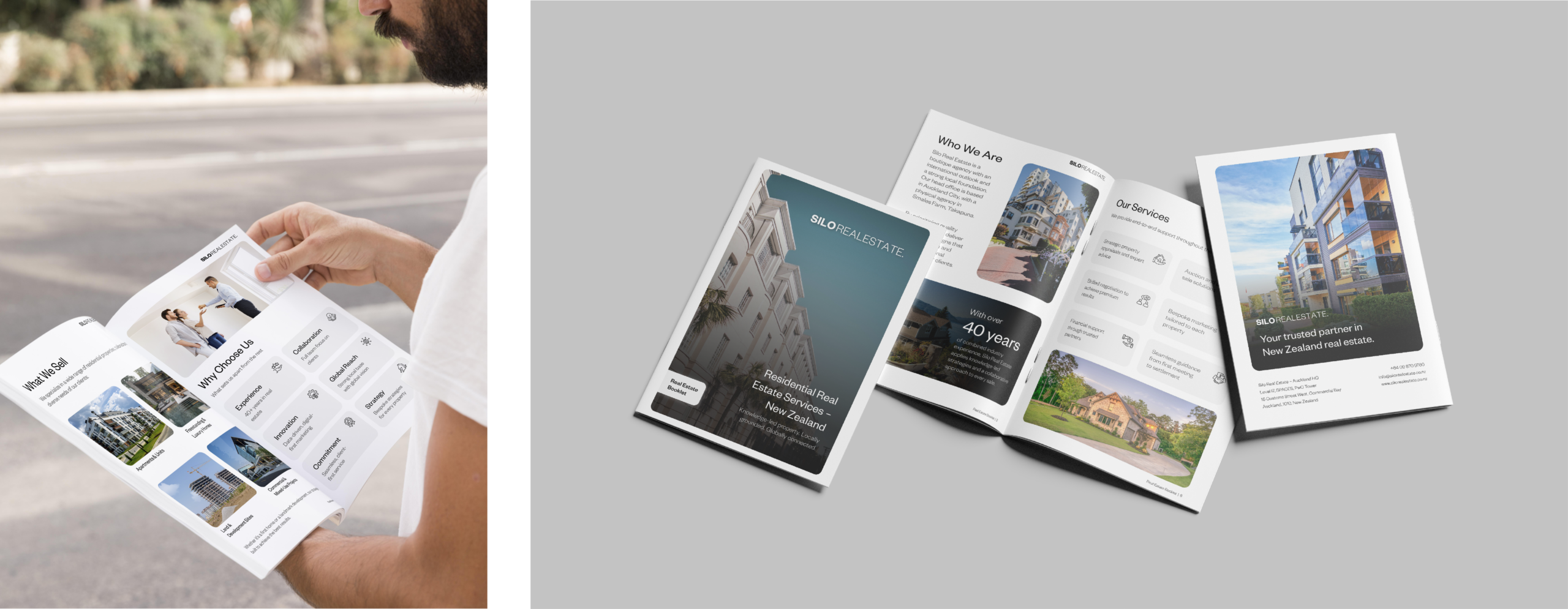
The booklet leads with restraint. A clean black-and-white system with generous whitespace and large property photography signals premium without shouting, which is the right register for high-value residential clients. The brand mark and a single accent carry through every page so the document feels like one considered piece rather than a stack of facts.
Information that could have been dull is given visual structure: services sit in an even icon grid, the regions become a single map of New Zealand rather than a list, and the proof is staged as two large figures so the track record lands before the supporting detail. We sequenced the booklet as a narrative, who Silo is, what they sell, where they work, how they market, and the results, so a reader moves through a story rather than scanning a brochure.